library(ggalign)
#> Loading required package: ggplot2
#> ========================================
#> ggalign version 1.2.0.9000
#>
#> If you use it in published research, please cite:
#> Peng, Y.; Jiang, S.; Song, Y.; et al. ggalign: Bridging the Grammar of Graphics and Biological Multilayered Complexity. Advanced Science. 2025. doi:10.1002/advs.202507799
#> ========================================circle_genomic()
Genomic density and Rainfall plot
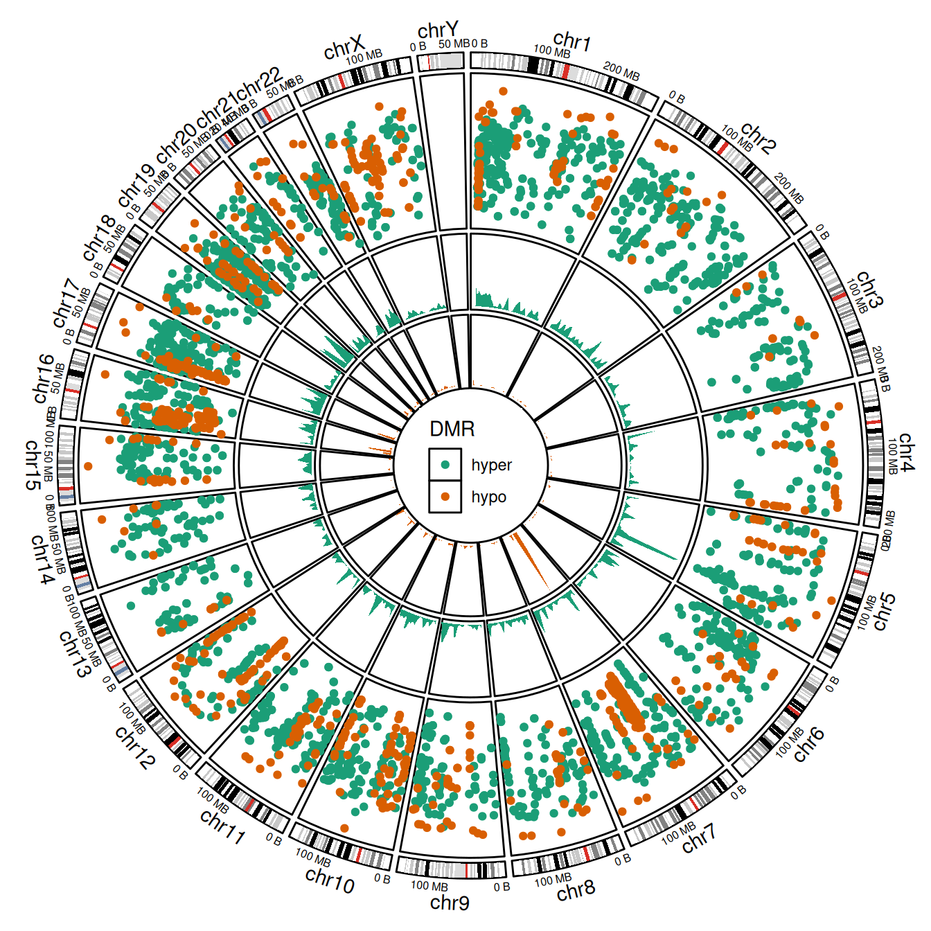
Rainfall plots are a powerful tool to visualize the distribution and clustering of genomic regions across the genome. Each point in a rainfall plot represents a genomic region, with:
- The x-axis showing its genomic coordinate.
- The y-axis showing the log-transformed minimal distance to its two neighboring regions (
log10(dist)).
Clusters of nearby regions appear as dense “rainfalls” of points, making this approach ideal for identifying mutation hotspots, differentially methylated regions (DMRs), or other non-random patterns of localization.
However, when region density is high, overplotting can obscure meaningful interpretation. To address this, we overlay a genomic density track that summarizes the fraction of a genomic window covered by regions—providing a smoother representation of local enrichment.
The data comes from the circlize package and includes both hyper- and hypo-methylated DMRs in the human genome.
load(system.file(package = "circlize", "extdata", "DMR.RData", mustWork = TRUE))
bed_data <- dplyr::bind_rows(hyper = DMR_hyper, hypo = DMR_hypo, .id = "DMR") |>
    dplyr::relocate(DMR, .after = dplyr::last_col())
if the amount of regions in a cluster is high, dots will overlap, and direct assessment of the number and density of regions in the cluster will be impossible. To overcome this limitation, additional tracks are added which visualize the genomic density of regions (defined as the fraction of a genomic window that is covered by genomic regions).
circle_genomic(
    "hg19",
    radial = coord_radial(inner.radius = 0.2, rotate.angle = TRUE),
    direction = "inward",
    theme = theme(
        plot.margin = margin(t = 10, b = 10, l = 2, unit = "mm")
    )
) -
    # Remove radial axes for a cleaner circular look
    scheme_theme(
        axis.text.r = element_blank(),
        axis.ticks.r = element_blank()
    ) +

    # Cytoband (Ideogram) Layer ------------------
    plot_ideogram() +
    scale_x_continuous(
        breaks = scales::breaks_pretty(2),
        labels = scales::label_bytes("MB")
    ) +
    guides(
        r = "none", r.sec = "axis",
        theta = guide_axis_theta(angle = 0)
    ) +
    theme(axis.text.theta = element_text(size = 6)) +

    # add rainfall plot -----------------------
    ggalign(bed_data) +
    geom_point(
        aes(middle, log10(dist), color = DMR),
        data = function(d) {
            d <- dplyr::bind_rows(!!!lapply(
                split(d, ~DMR), function(dd) genomic_dist(dd)
            ))
            d$middle <- (d$start + d$end) / 2
            d
        }
    ) +
    scale_color_brewer(
        palette = "Dark2",
        guide = guide_legend(
            position = "inside",
            theme = theme(
                legend.position.inside = c(0.5, 0.5),
                legend.key = element_rect(color = NA),
                legend.title = element_text(face = "bold")
            )
        )
    ) +

    # add density plot -----------------------
    ggalign(DMR_hyper, size = 0.5) +
    geom_density(
        aes(middle, density, color = after_scale(fill)),
        fill = RColorBrewer::brewer.pal(3, "Dark2")[1L],
        stat = "identity",
        data = function(d) {
            d <- genomic_density(d)
            d$middle <- (d$start + d$end) / 2
            d
        }
    ) +
    ggalign(DMR_hypo, size = 0.5) +
    geom_density(
        aes(middle, density, color = after_scale(fill)),
        fill = RColorBrewer::brewer.pal(3, "Dark2")[2L],
        stat = "identity",
        data = function(d) {
            d <- genomic_density(d)
            d$middle <- (d$start + d$end) / 2
            d
        }
    ) &
    theme(panel.background = element_rect(color = "black", fill = NA))