This chapter shows simple usage examples of ggalign.
Code
library(ggalign)#> Loading required package: ggplot2#> ========================================#> ggalign version 1.2.0.9000#> #> If you use it in published research, please cite: #> Peng, Y.; Jiang, S.; Song, Y.; et al. ggalign: Bridging the Grammar of Graphics and Biological Multilayered Complexity. Advanced Science. 2025. doi:10.1002/advs.202507799#> ========================================
2.1 Data-Free Composition
The usage of data-free composition is simple: just create plots first then arrange plots together!
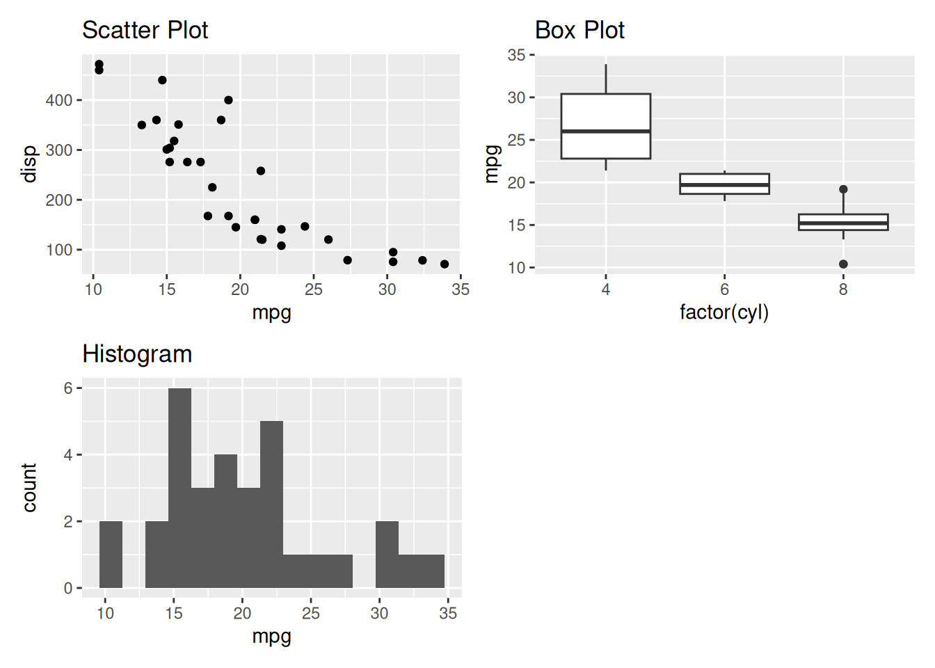
The align_plots() function offers flexible control over grid dimensions, sizing, and layout specifications. You can control the arrangement with parameters like ncol, nrow, widths, heights, and even use area() specifications for complex layouts.
ggalign provides various options to control layout specifications, including whether to collect legend guides, align axes, and more. For more, see Part Data-Free Composition.
2.2 Data-Aware Composition
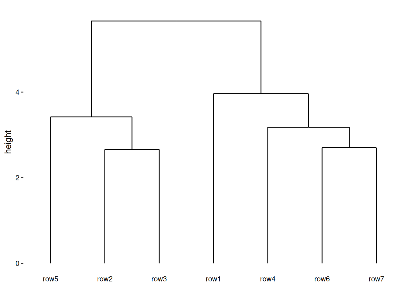
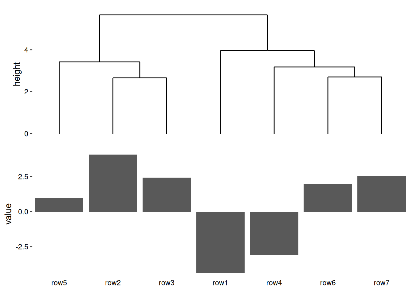
A common use case for data-aware composition is combining a heatmap with a dendrogram. The dendrogram reveals hierarchical relationships among the data (e.g., samples or genes), and the heatmap is reordered to align with the dendrogram structure—ensuring consistent interpretation.
ggheatmap(mat)#> → heatmap built with `geom_tile()`
With ggalign, you can add elements using the same + syntax as in ggplot2. For example, to add a dendrogram above the heatmap:
ggheatmap(mat) +anno_top() +align_dendro()#> → heatmap built with `geom_tile()`
1
We initialize a heatmap layout.
2
we initialize an annotation in the top side of the heatmap body.
3
Add a dendrogram tree in the top annotation, and Reorder and group the observations based on hierarchical clustering.
This automatically reorders the heatmap rows or columns to reflect the hierarchical structure in the dendrogram.
While data-aware composition is the core strength of ggalign, its full capabilities go beyond a single example. For more advanced features and finer control, see Part Data-Aware Composition.
2.3 When to Use Each Approach
Use data-free composition when: - Combining unrelated plots for publication figures - Creating dashboard-style layouts - Arranging plots with different data sources - Simple spatial arrangement is sufficient
Use data-aware composition when: - Analyzing the same dataset from multiple perspectives - Creating heatmaps with annotations - Ensuring observation consistency across plots - Working with genomic, transcriptomic, or other omics data
This foundational understanding of ggalign’s two composition modes will guide you through the more advanced features covered in subsequent chapters.